.png?format=1500w)
Transform customers’ complex health data into actionable insights
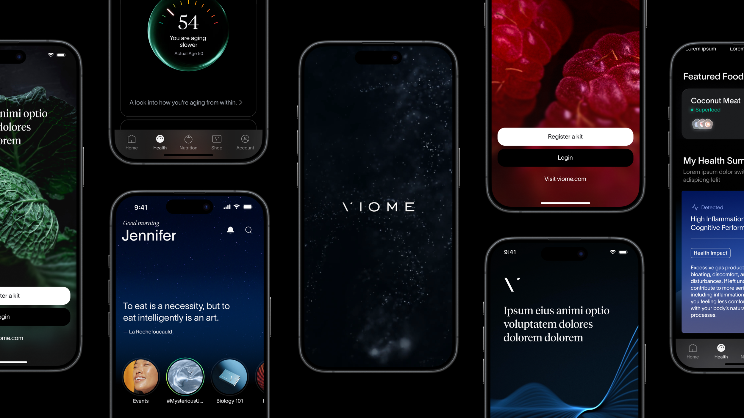
APP REVAMP
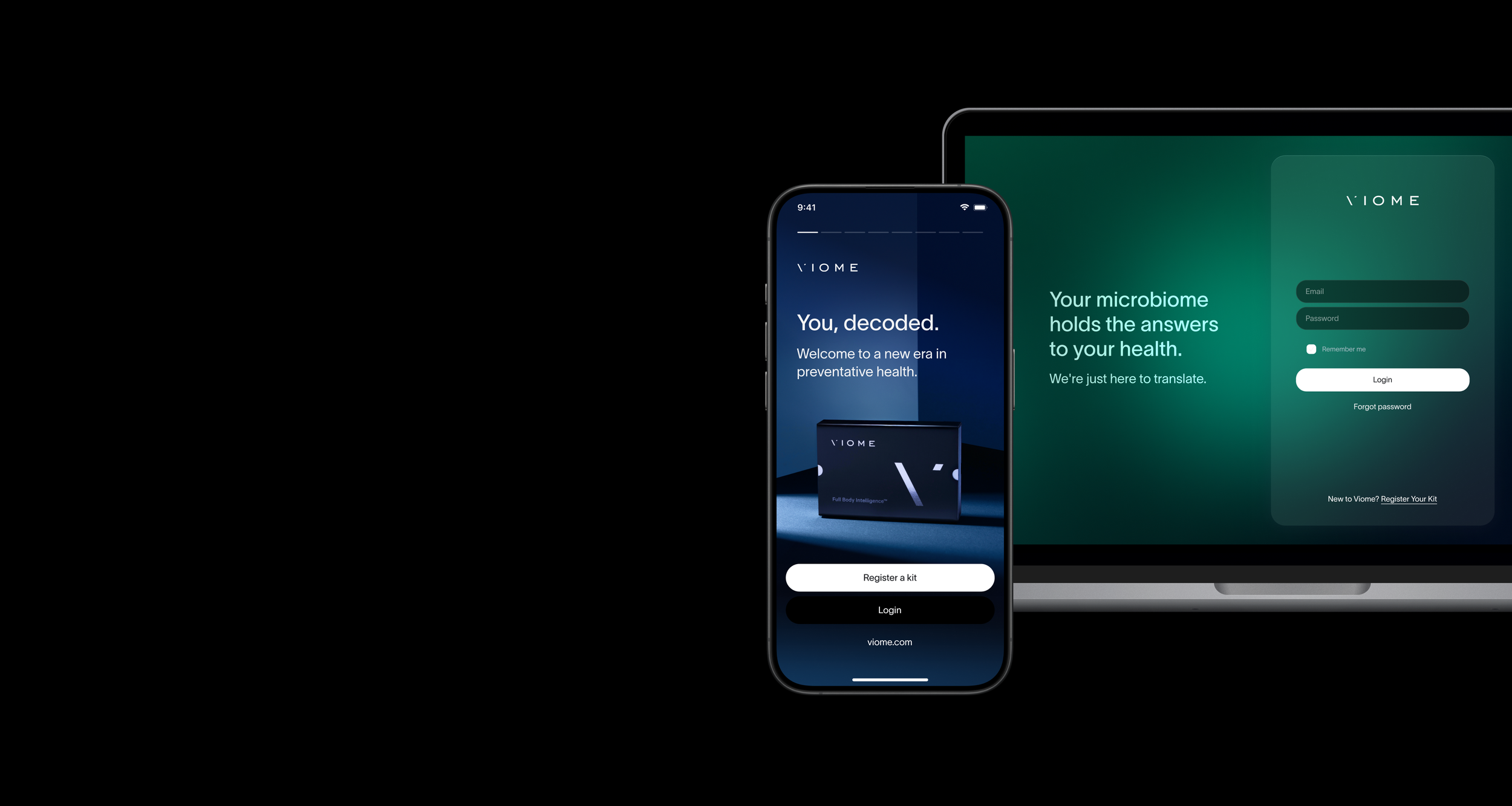
WHAT IS VIOME?
Viome is a Series D health tech company providing test-based health insights and personalized nutrition.

Health Tests
At-home microbiome tests using stool, blood, and saliva samples to generate health insights.

Personalized Supplements
Viome also sells subscription-based personalized supplements tailored to health tests results.
OVERVIEW
Through collaboration with product (3), marketing design (2), clinical nutrition (3), bioinformatics (4), engineering (10+), external design contractors (2), I led the UX redesign of the Viome app by optimizing its information architecture, simplifying complex health insights, and navigating a huge scope.
Project Summary
My Role
UX Research & Design Lead
Timeline
Nov 2024 – Jan 2025
Business Impact
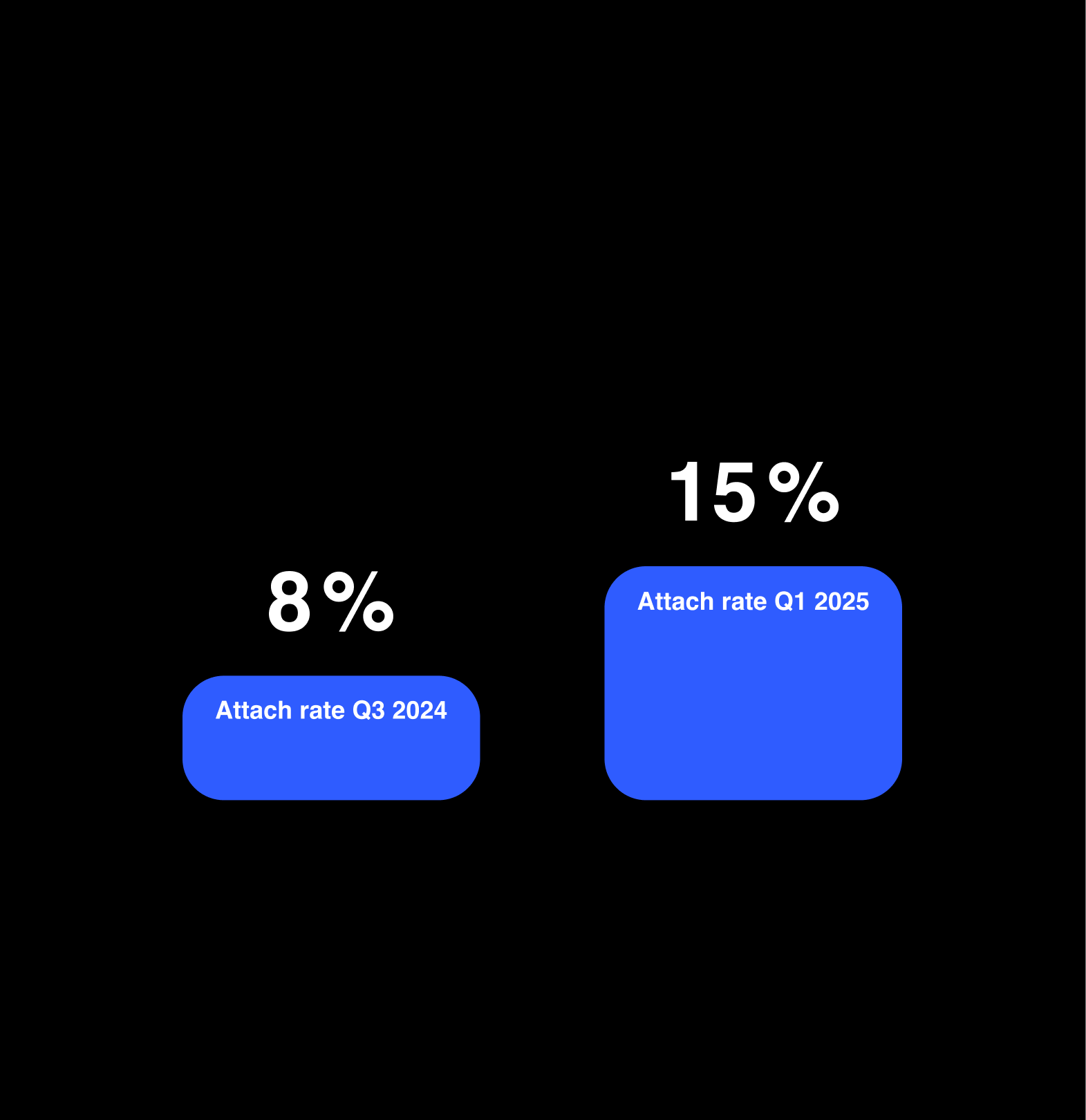
Improved customer understanding of their Viome health test results and increased attach rate from 8% to 15%.
THE REAL PROBLEM
Customers struggled to understand their health test results, and expressed that Viome health test didn’t deliver enough value.
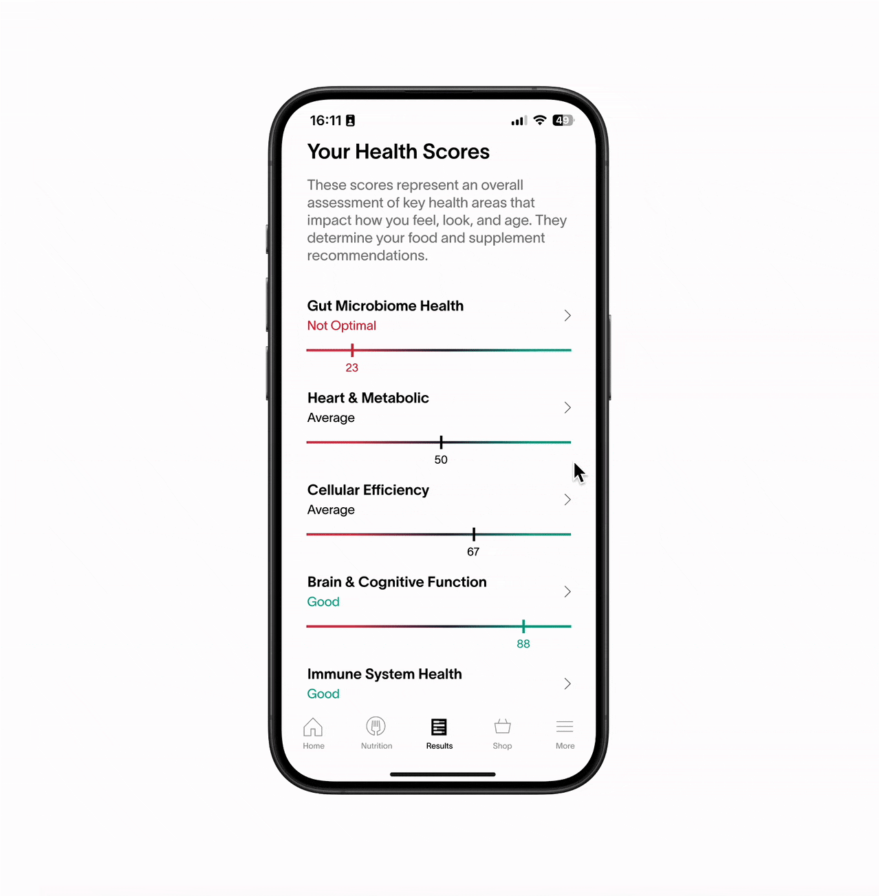
Viome health test results have two main sections: Health Scores and Nutrition Recommendations. Let's look at the Health Scores first.
ISSUES – THE BEFORE VERSION
Information Overload
The information hierarchy on the Results tab was flat, and all the health scores were presented in a list view, causing information overload for customers.
Health Insights Not Actionable
Customers reported that after receiving their results, they felt overwhelmed and unsure how to proceed.
ISSUES – THE BEFORE VERSION
Content Too Generic
The information on the Health Score Details Page was long and generic, customers didn’t know what to do to improve their health with this information.
THE AFTER VERSION
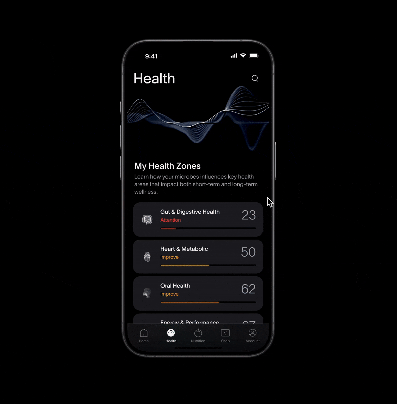
Optimized IA
Working with the bioinformatics team, I optimized the information hierarchy. The original long list of health scores is now grouped by Health Zone, showing how the scores relate to each other.
Progressive Disclosure
Display essential information first, and then allow users to tap the component to reveal details.
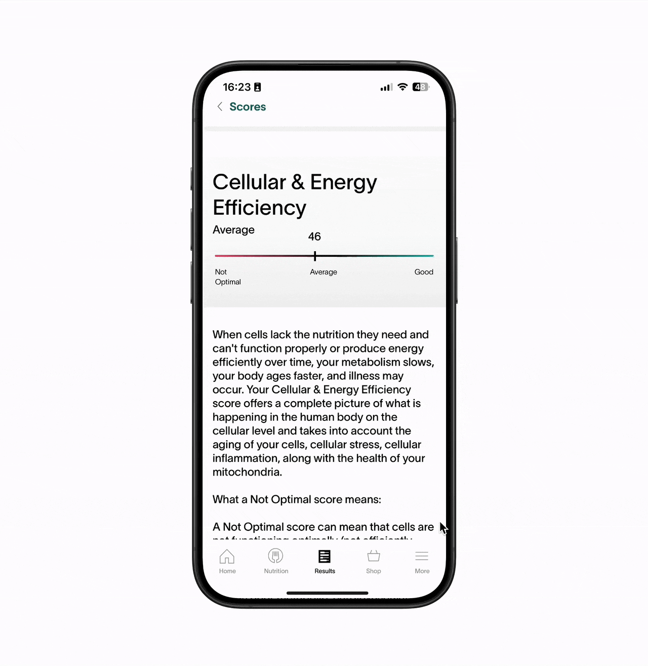
THE AFTER VERSION
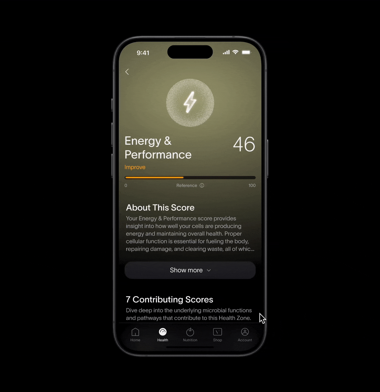
Personalized Content
I collaborated with the bioinformatics team to rewrite the content for health scores. Now on each details page, the information is more digestible and personalized.
Connect Health to Nutrition
An entry point to the Nutrition section is now included on each Health Score Details Page, guiding customers on what foods to eat and avoid to improve their Health Zone.
Now let's look at the Nutrition Recommendation part of the app. It shows customers what foods to eat and what foods to avoid.
ISSUES – THE BEFORE VERSION
Long Overwhelming Food List
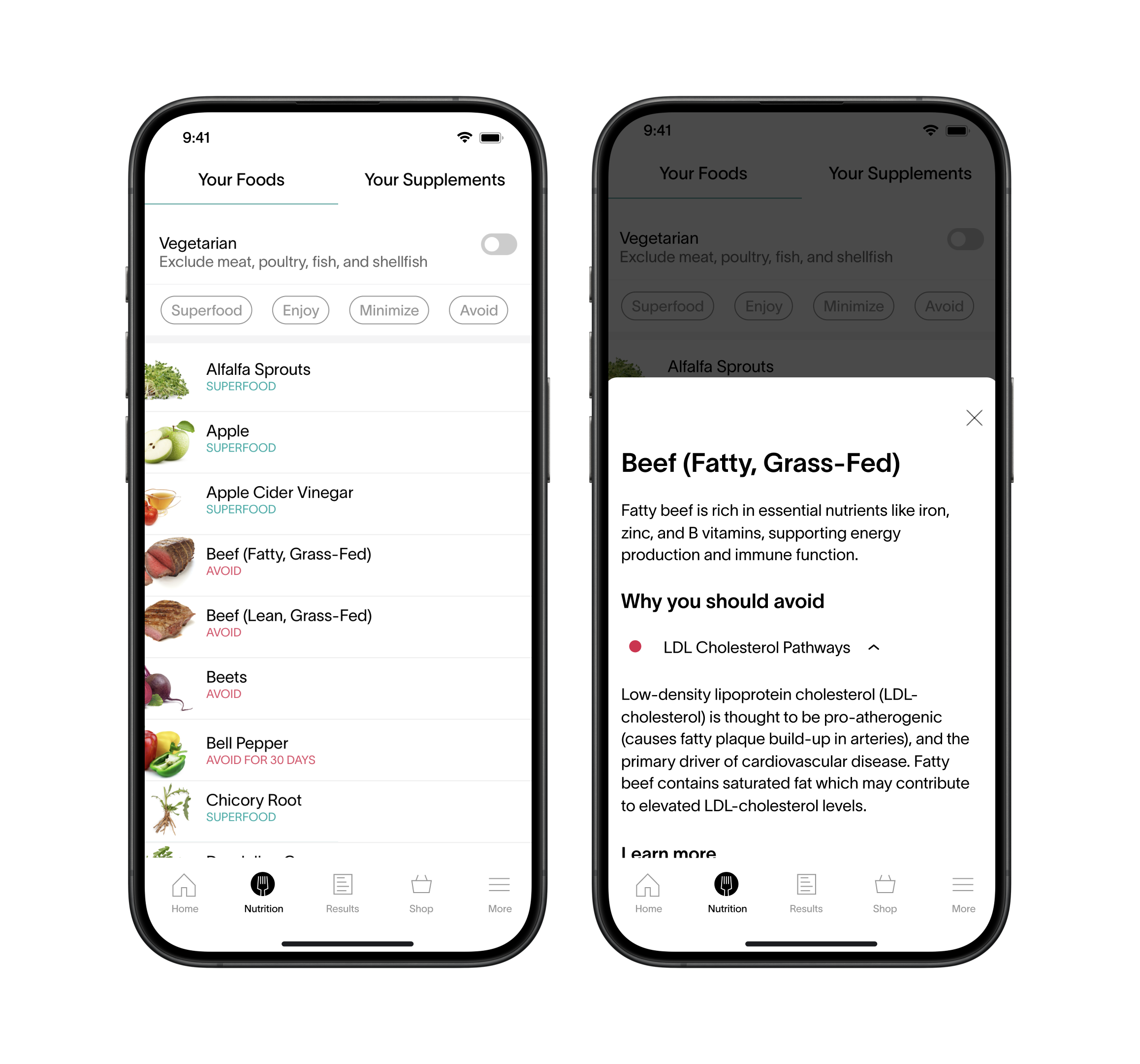
Similar to Results tab, the nutrition recommendation was also overwhelming. There was a list of 350+ foods.
Technical Jargons
Terms like “LDL Cholesterol Pathways” were too hard to understand. Customers had to read slowly to figure out what it meant.
THE AFTER VERSION
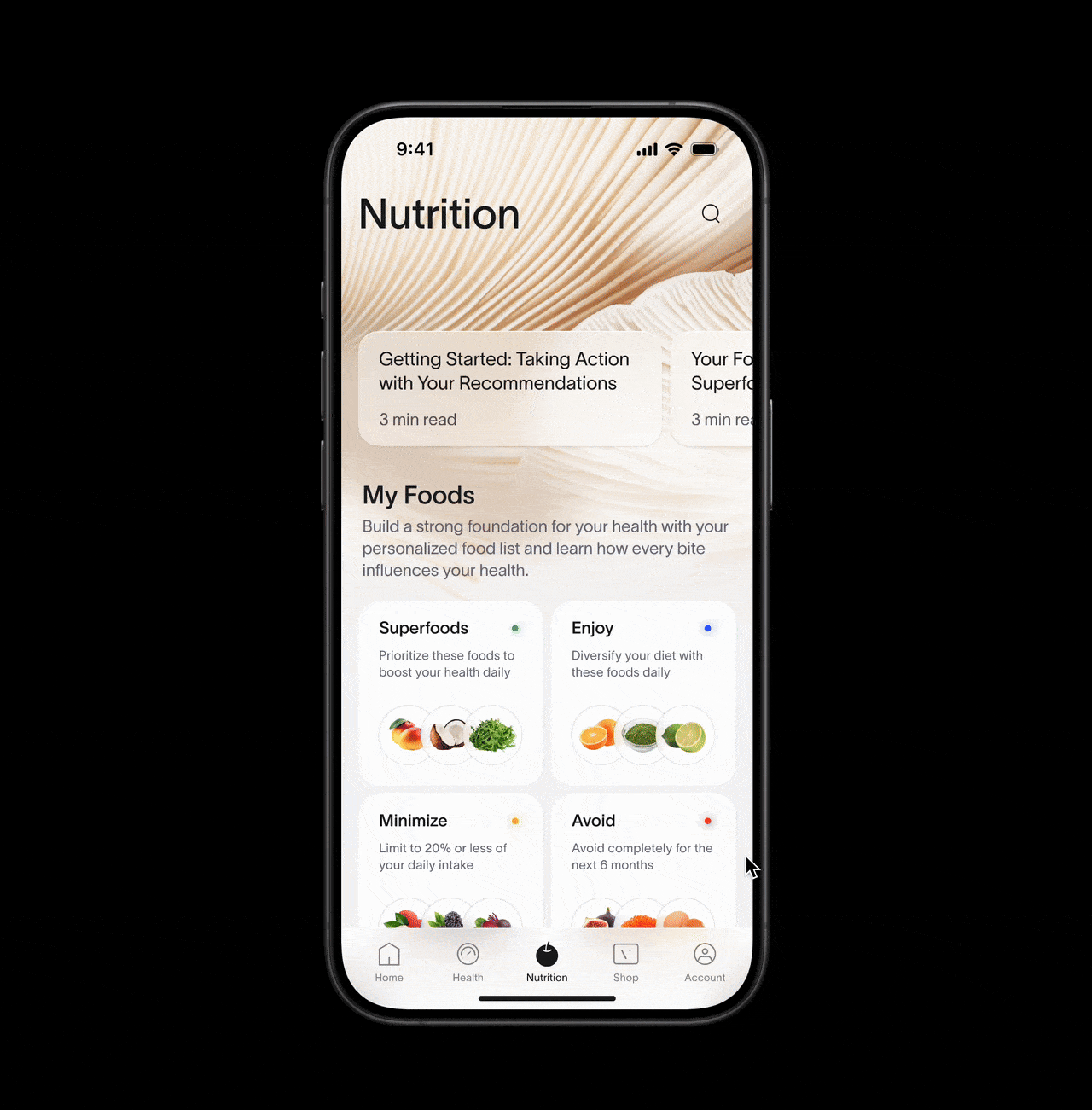
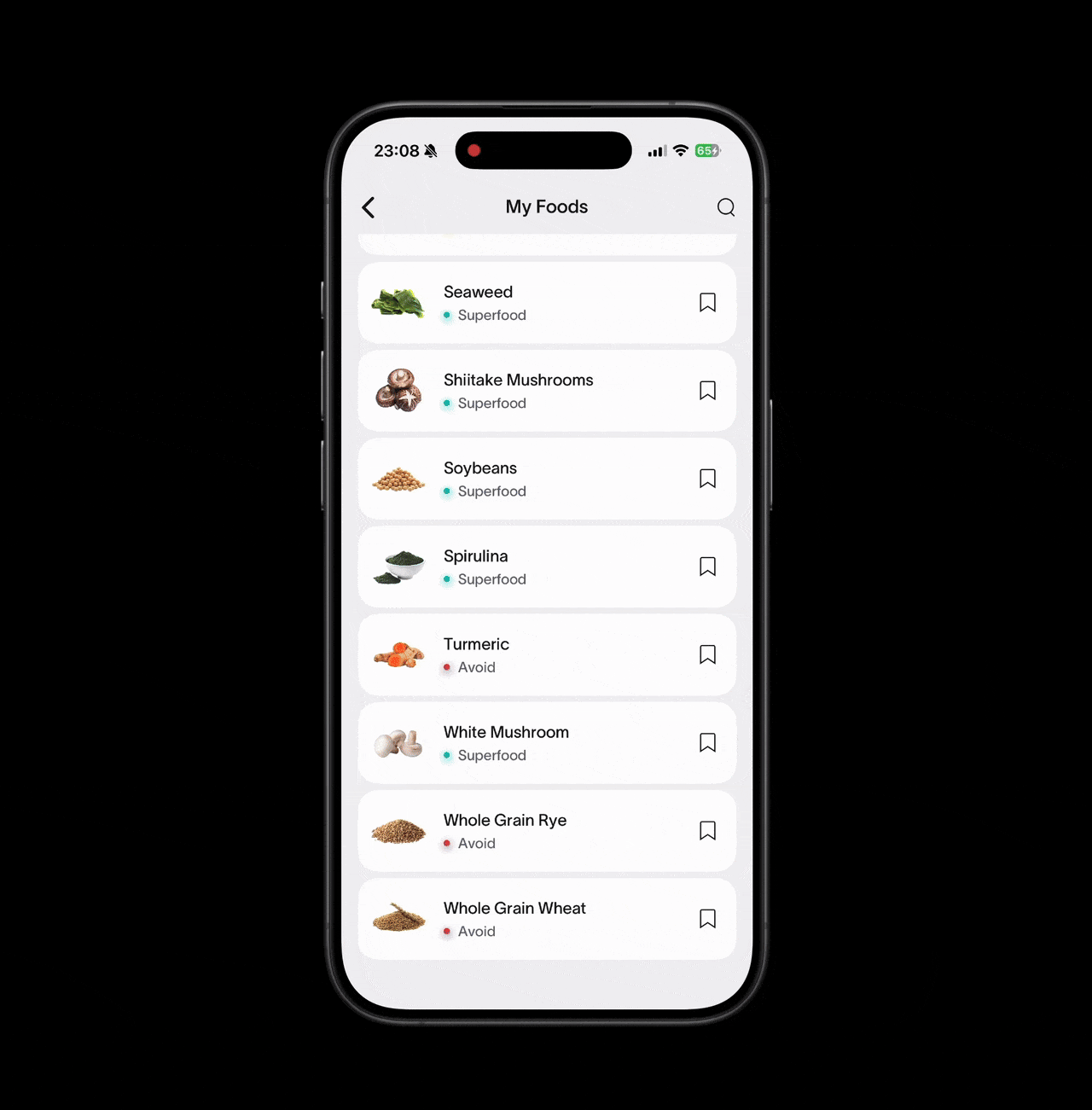
Clearer Food Categories
Customers quickly see that foods are divided into four groups: Superfoods, Enjoy, Minimize, and Avoid. These food groups help them follow their food recommendation.
Better Discoverability
Before, the Nutrition page was flat, making it hard to discover personalized supplement recommendations. Now, these recommendations appear right below the food suggestions on the same page.
THE AFTER VERSION
Actionable Insights
Introduced Health Zone Filtering to allow users to refine their food list based on specific wellness goals (e.g., Gut Health optimization).
THE AFTER VERSION
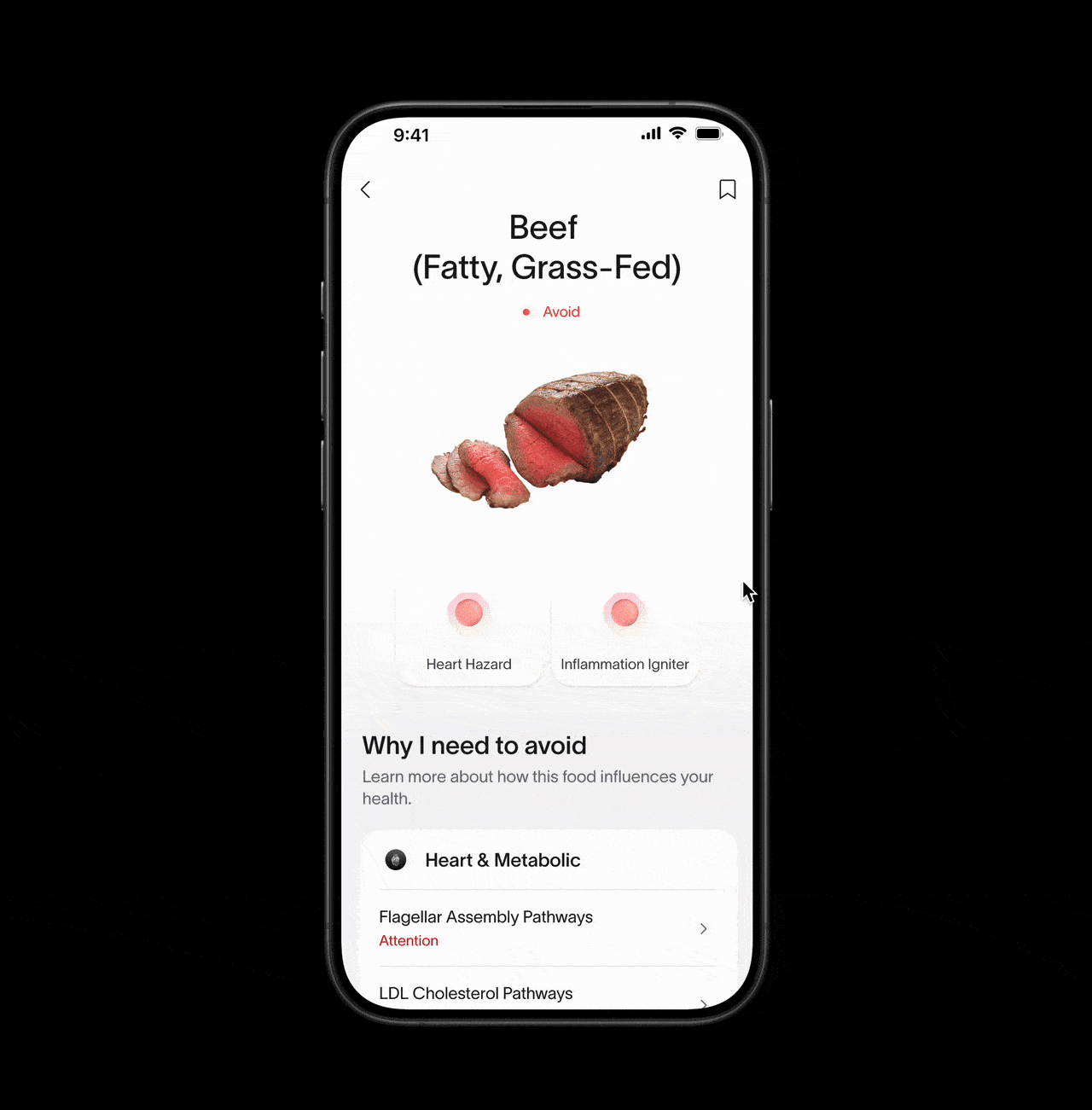
Enriched Nutrition Guidance
The updated Food Details Page now features a full-page breakdown explaining why the food is suggested or should be avoided. This also includes a comprehensive nutrition profile and cooking tips.
OUTCOME
The app revamp I led increased attach rate 1.88x.
How was it measured?
Working with the product team, we measured the conversion rate of customers from receiving their Viome health test results to subscribing to a personalized supplement plan.